Showing posts with label painting. Show all posts

Friday, 3 April 2009

Willem De kooning!


This is in relation to Mark Rothko, De Kooning's paintings started, well not colourful, but not dark, you can trace this descent into poverty in the 20' and 30's because of the change in colour, shape and form. (to poor to buy fine quailty artists paint, he used household black and white enamels  You can also see the effects of alzheimer's within the colours used...  


A biography of his life can be found on this website http://www.spiritus-temporis.com/willem-de-kooning/
I think that you can see the difference between his earlier work, and the work that he made whilst living in poverty, the black painting is called "Black Friday" . 
I'm starting to really understand the strong link between an artists personal life and the way that they go about making art work. It could be interesting to look at some past work that we've done and try to link it up to times in our lives, and what they represent to us.


Thursday, 2 April 2009

Process


Hey guys, just thought i'd blog how far i am with my canvasses. I have painted all four but need to ad layering and glue. Im guessing im nearly done. My palette now looks like this and has caused me grief today cleaning it :). Hope all is well for all of you and i hope to see photographs of the canvasses soon!
Enjoy

Wednesday, 1 April 2009

Leonardo Cremonese


This painting by Cremonese involves using oil paint on linen. Born in Brazil, Cremonese then moved to Sydney where he has been exhibiting work since 1991. His bright colours are inspiring and striking attracting the audience further into his work. He use of application is apparent in all of his works which creates a texture which is very unique. I like his loose and experimental feel throughout his work.


Mark Rothko


When Rothko started his colour field paintings they were radiant and bright progressively getting darker as he continued to progress to the point where he was producing black/grey and just black paintings at which point he committed suicide!! So moral of story......Don't paint Black!!

But to the point, Rothko's paintings are very intense...huge fields of colour which draw you into them....ie audience engagement. He built up layers of thin paint which evolved into a luminous vision on huge canvasses.


"Rothko, however, generally avoided explaining the content of his work, believing that the abstract image could directly represent the fundamental nature of human drama. For him, eschewing
representation permitted greater clarity, the elimination of all obstacles between the painter and the idea and between the idea and the observer."

I think that last statement is useful in thinking about how we will display and engage an audience in our colour works.

Tuesday, 31 March 2009

Gerhard Richter

"Gerhard Richter (born Dresden, 1932) is one of the world’s greatest living artists. Since the early 1960s he has tirelessly explored the medium of painting at a time when many were heralding its death. He has produced a remarkably varied body of work, including photography-based portrait, landscape and still-life paintings; gestural and monochrome abstractions; and colour chart grid paintings. In autumn 2008, the Serpentine presented 4900 Colours, a major new work comprising bright monochrome squares randomly arranged in a grid formation to create stunning sheets of kaleidoscopic colour.
4900 Colours comprises 196 square panels of 25 coloured squares that can be reconfigured in a number of variations, from one large-scale piece to multiple, smaller paintings. Richter developed a new version especially for the Serpentine Gallery exhibition: 4900 Colours: Version II, formed of 49 paintings of 100 squares.
4900 Colours is in the context of Richter’s design for the south transept window of Cologne Cathedral, which replaced the stained glass that was destroyed in World War II. Cathedral Window, unveiled in August 2007, comprises 11,500 hand-blown squares of glass in 72 colours that are derived from the palette of the original medieval glazing."

I guess in a way we are exploring a similar concept.....a painting derived from a palette of our own colours?...Maybe!


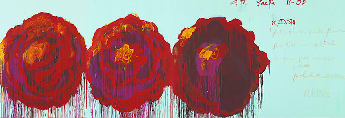
Cy Twombly

I am as always drawn to Cy Twombly's work and given that we are going to be painting it is a good excuse to look at his work again. Also his work is driven by humanity and the perspectives of!!! I.e. painting perspectives! I certainly agree with you Claire about the aura paintings, and am not keen, but as you say it seems to be the way painting portrays human aura's ...which makes me want to keep well away from that approach. I am inclined to take my lead from Twombly and work towards an introspective...but not.... nostalgic, romantic view of
human .....or in this/our case..... a feminine perspective.


This particular work (The Rose) is his latest...currently (which I why I used these images) at the Gagosian London.

Twombly works subjectively and I think with a subtlety not found in other, more renowned abstract expressionists of his time who err on the side over dramatising.
Well....that's just my opinion!!